PLAYTIME - BRANDING/EDITORIAL DESIGN
CORPORATE DESIGN
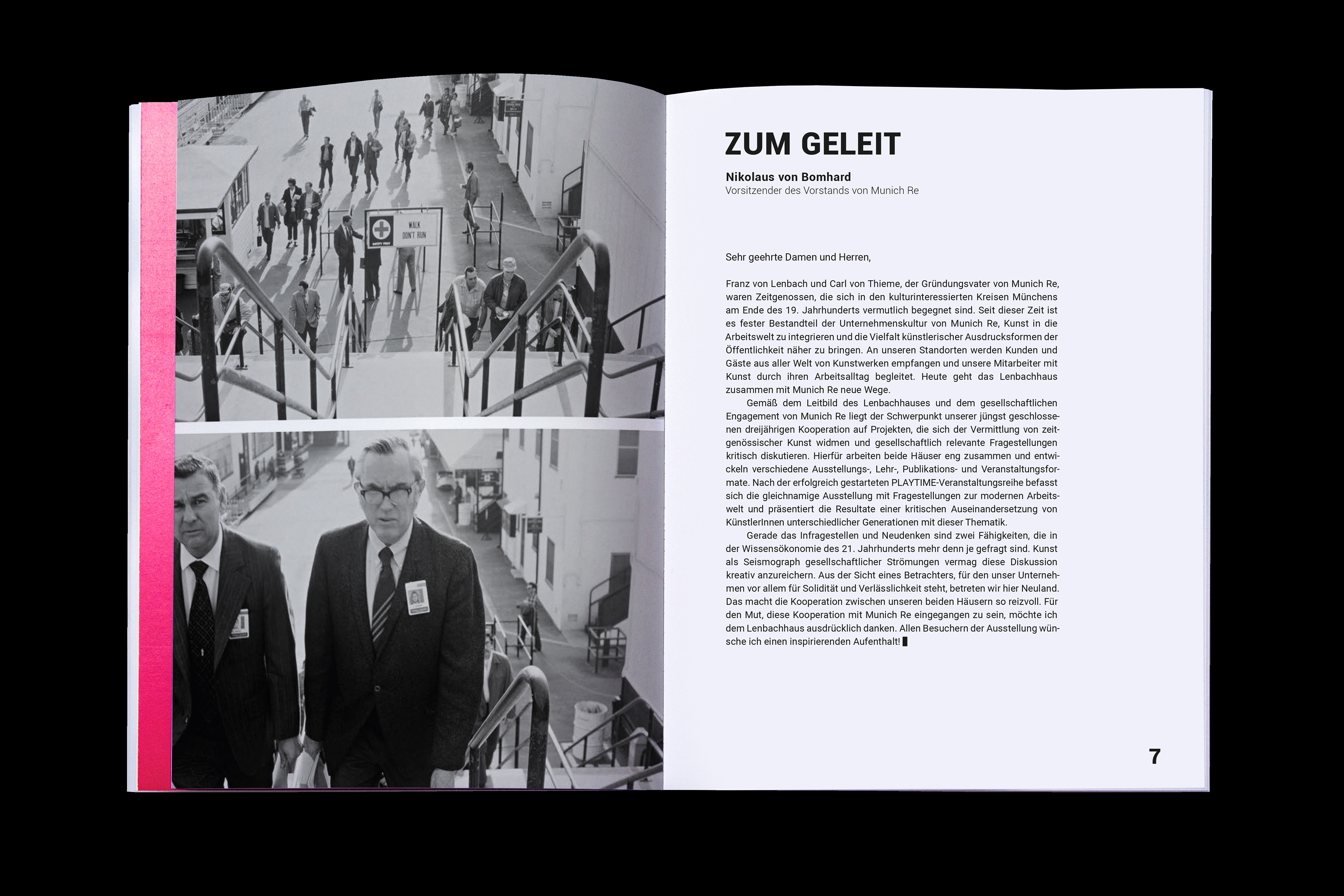
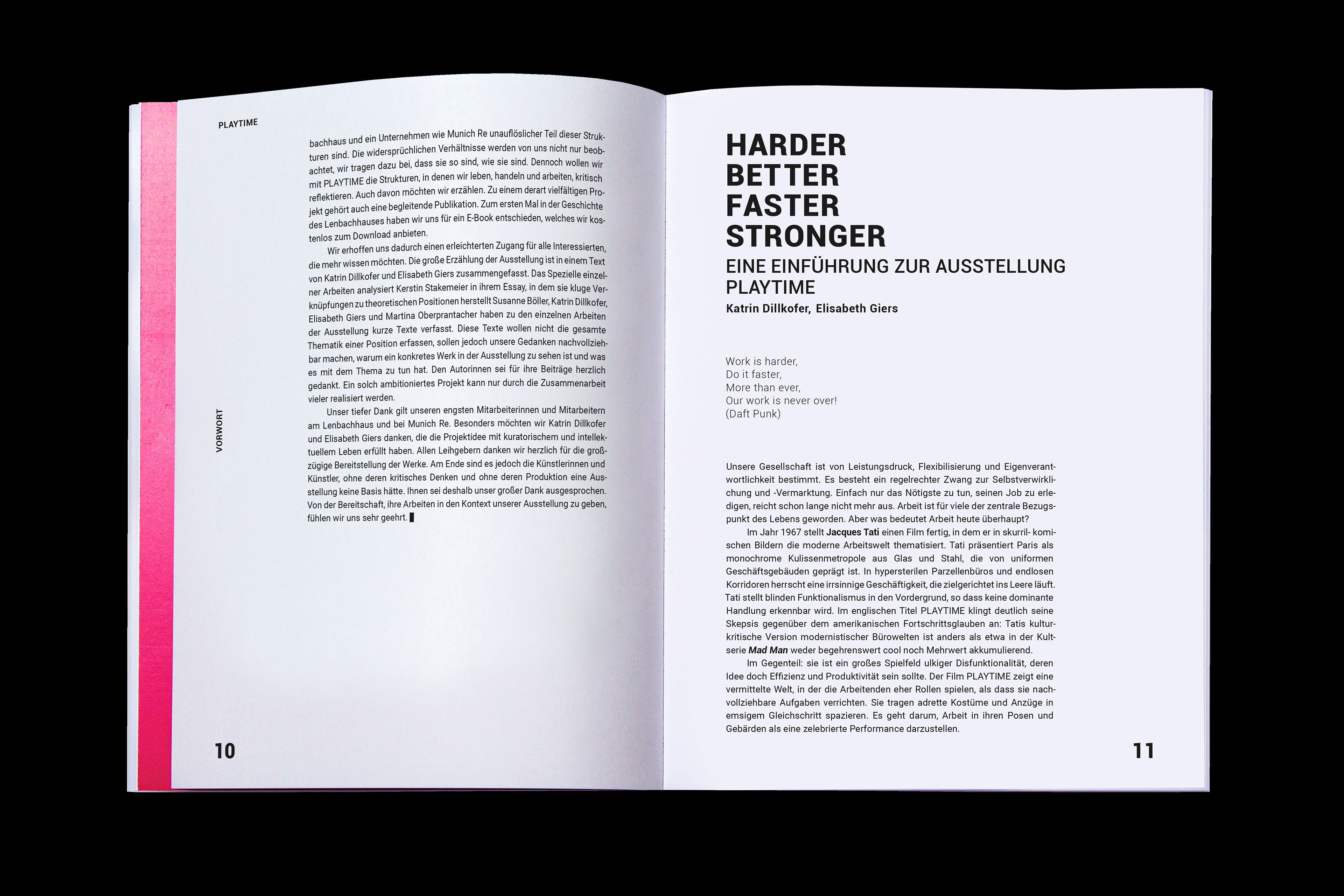
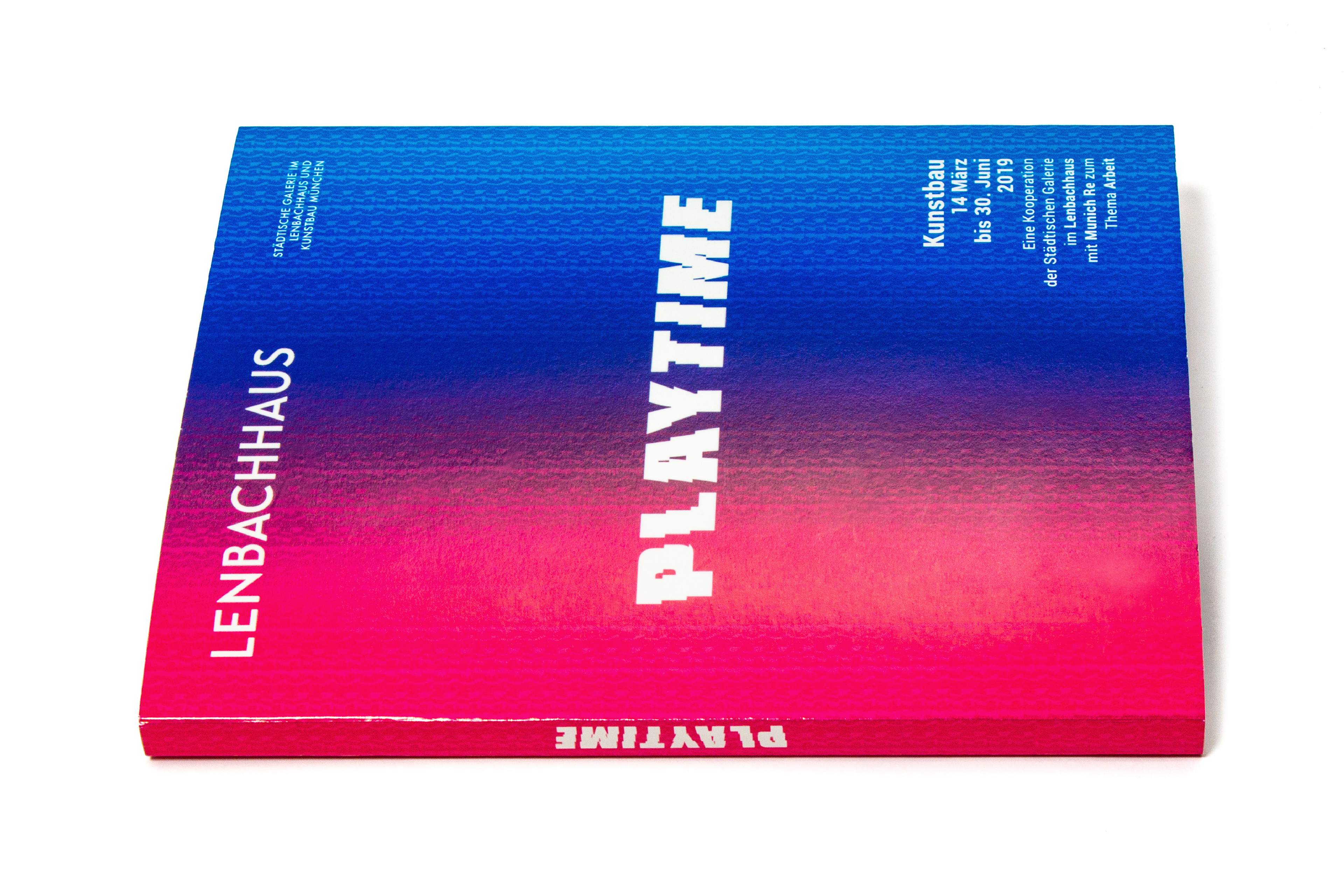
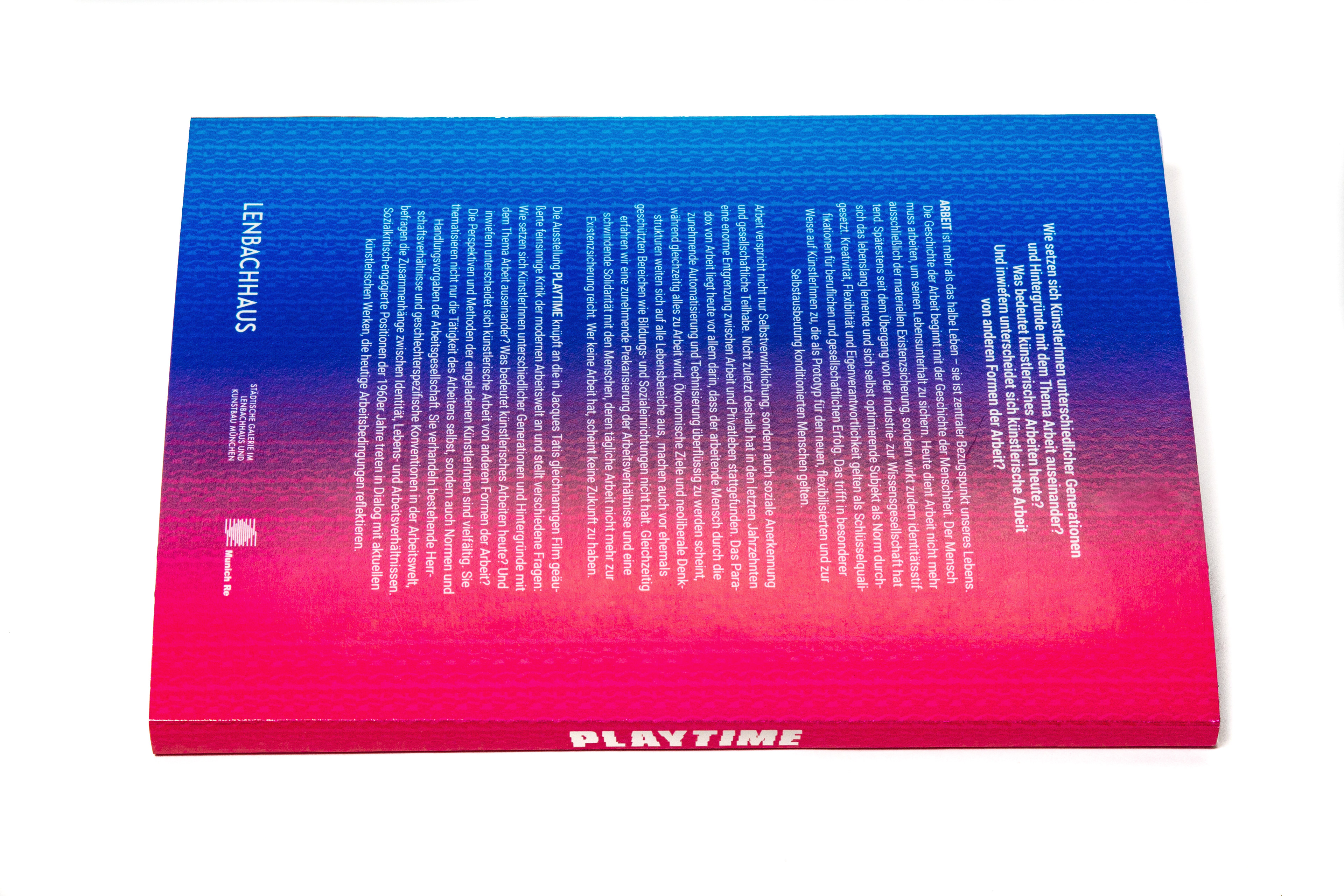
EXHIBITION CATALOG
Project as part of my education at the Designschule München
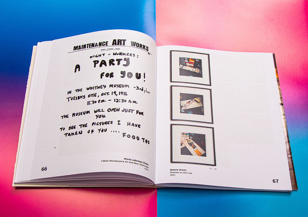
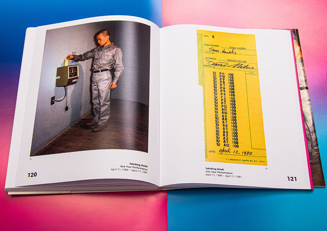
Task: Development of a corporate design for the special exhibition PLAYTIME in the Lenbachhaus in Munich. Branding elements such as logo, business cards and letterhead were created as well as the design of an exhibition catalog of the exposed artist and their works. (Fictional project)
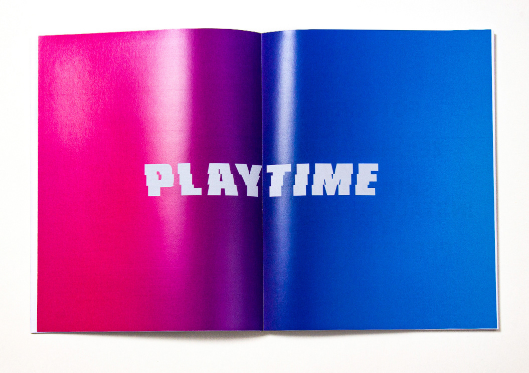
The name of the exhibition was Playtime, referring to Jacques Tati's movie. PLAYTIME tells of being active, of changes in working conditions, of the sense or nonsense of existing work processes, of remuneration and labour migration as well as self-realization and self-deception. The exhibition brings together artistic positions from the world of film, music and the visual arts.
EXHIBITION CATALOG
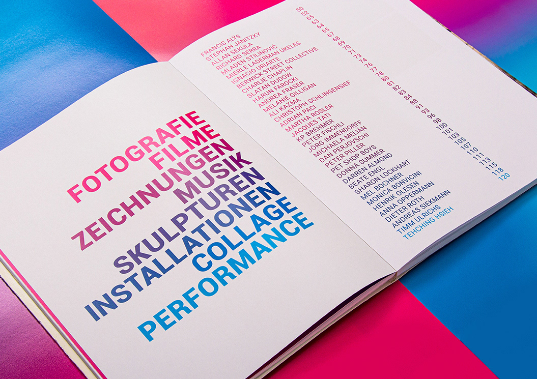
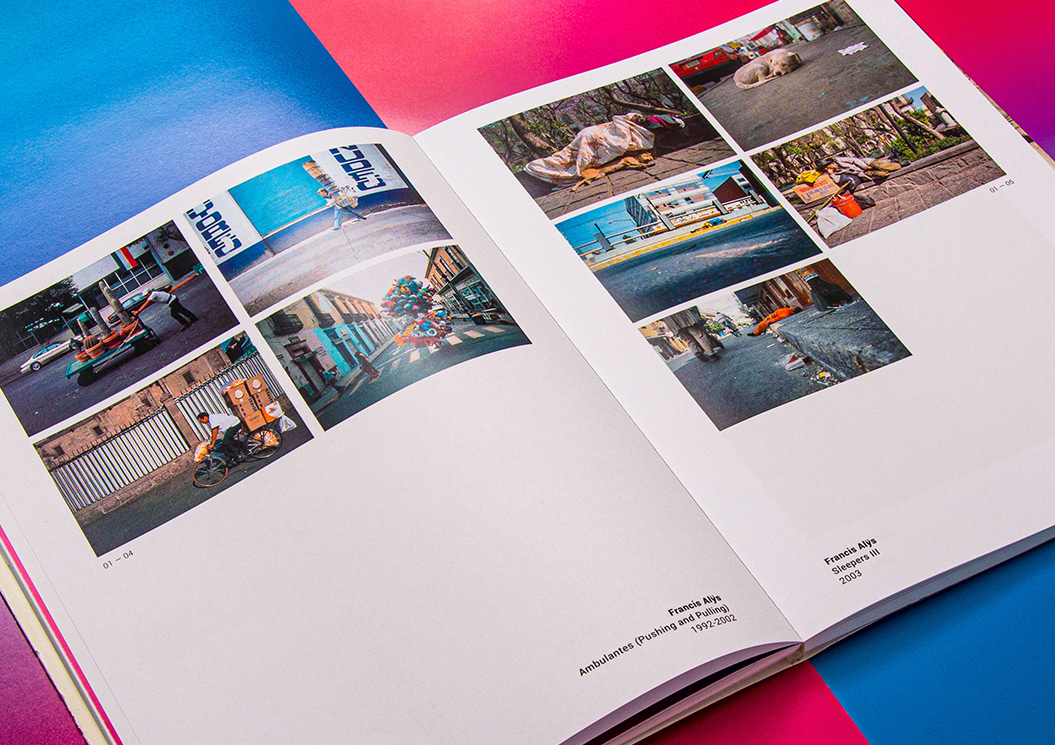
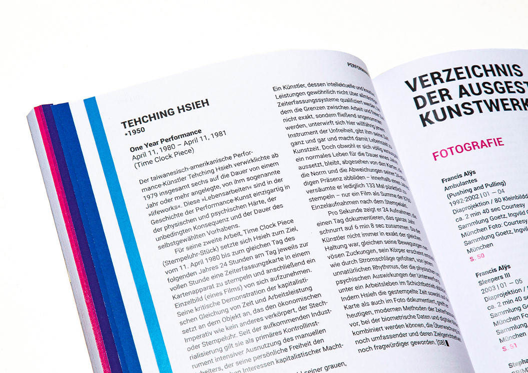
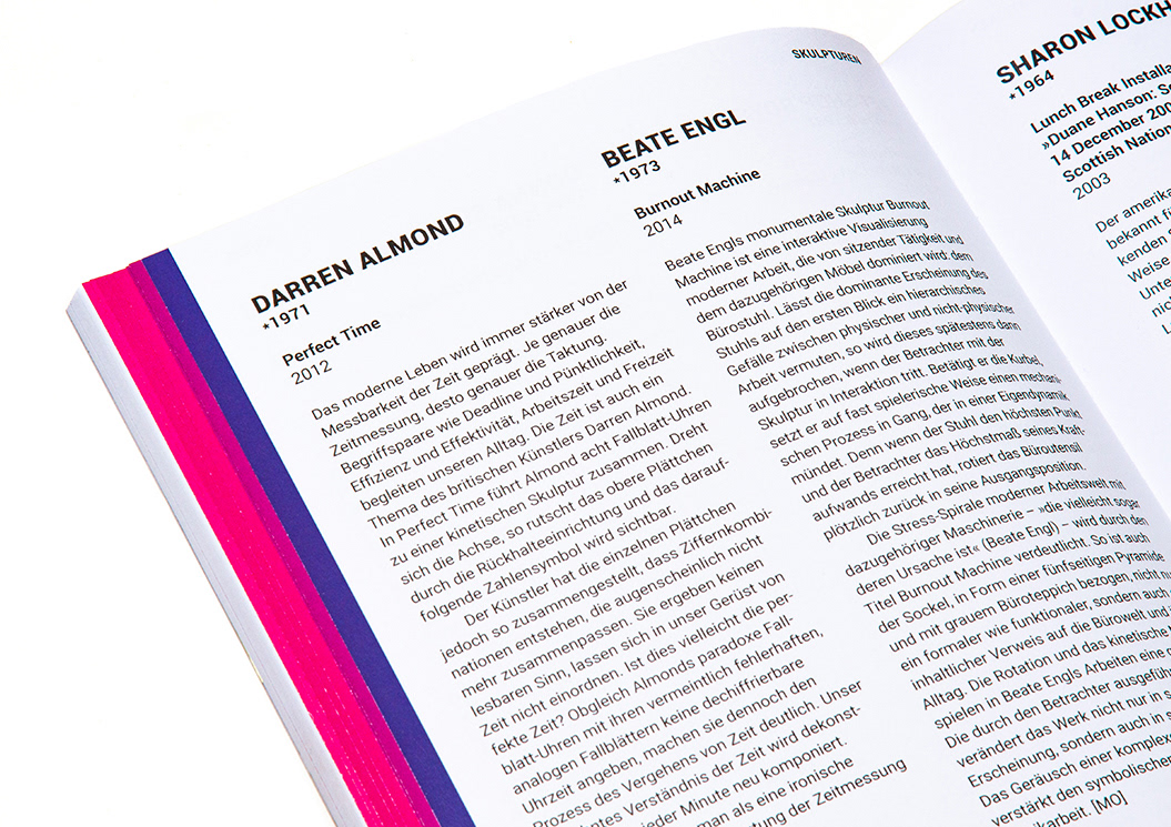
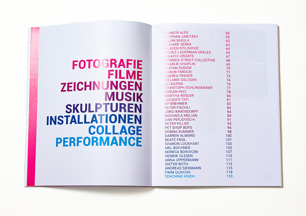
The structure of the themes of works and artists is set by a color system in alphabetical order. To illustrate the diversity of the exhibits, the artists were divided into eight different themes: photography, films, drawings, music, sculptures, installations, collage and performance. Each theme has a different color from the gradient of the book's cover.
WORK IS HARDER,
DO IT FASTER,
MORE THAN EVER,
OUR WORK IS NEVER OVER!
DO IT FASTER,
MORE THAN EVER,
OUR WORK IS NEVER OVER!
(DAFT PUNK)
